Question Four...
How did you use new media technologies in the construction and research, planning and evaluation stages?
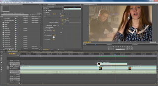
Adobe Premier Pro
The camera I used to capture my footage on was a Sony HD Handicam - HDR-CX130E
I chose to use the smaller digital camera rather than a larger HD camera that used a tape rather than a memory card. This was because of two reasons;
1, Because it was easier to transport a smaller camera around my locations because it could easily fit into a bag and be safe. With the larger camera I would be wary of carrying it around in case anything happened to it or it became difficult to travel around.
2, Another reason why I found it would be easier to use the smaller Sony camera is because that used an SD card to save the footage on; whereas the larger camera used a tape so however long you had filmed for you would have had to wait that length to get it capture it onto the edit suite. The SD card would quickly and easily transfer the footage into a folder, already cut into separate shots. I have used a tape camera in the past and the knowledge of having to upload what you have recorded restricts you from keeping the camera rolling to get accidental footage. With having a memory card I could keep on rolling and allow my actress/artist to get comfortable and come out of her shell more.

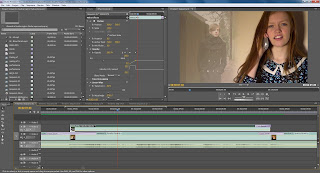
Before colour correction
After colour correction
Effect used: Matrox Colour Correction (Primary)
I have manipulated the hue and saturation of the image in such a way that highlights the brightness of the ginger hair and the green leaves.
I have used this effect throughout the video to make the moving image more vibrant and positive.
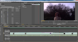
How I got this effect:
1. During the filming process, I recorded two mirroring shots from the same angle of the artist drinking.
2. When editing this part, I put one piece of footage over the other although the one on the top layer I set to half exposure, allowing the bottom layer of footage to seem though therefore creating the symmetrical effect emphasising the sadness and depression of the artists drinking (not shown in a glamorous light) relating to my target audience under the break-up situation.
To create the effect I added a Matrox Shine and manipulated it to to create colour rays and positioned the start at the bottom which creates this shining effect. Through my audience feedback I have established that the Matrox shine is one of the effects that people like the most.
This effect wasn't in my original plans, I originally intended to edit Blue to the side of the screen on the phone so show who Sofie was talking to. Then I decided to have the lyrics in the blank space next to her but a friend said the non-diegetic lyrics looked out of place, instead I was given some audience feedback from another friend whilst showing her that I was struggling to put something in the blank space.
She suggested that I fade some footage of Blue that I had captured previously, one of Blue walking and one of him sitting at a table, these add to the effect that although she's thinking about Blue her thoughts are fading away because she is getting over him.
How I did this effect was similar to the symmetrical drinking effect where I had the original base footage of Sofie on the phone, then put Blue's footage over it. I then put a linear wipe on around 50% of the footage of Blue and feathered it to 90% to make the wipe smoother, then I set that footage to less exposure, giving the fading effect.
How I created this effect:
I put one piece of footage on top of the other and sped up the top one whilst fading it into the background to give the ghostly arms effect, similar to that of the
Ellie Goulding Video.
A faded transition into a graphic match of her arms raised beside her head.
This effect is the effect that I am most proud of.
I took a tilt upward from one day and juxtaposed it with a footage on a previous day and manipulated it so that it looked within the same conditions by using a luminance map which blends the end of the first piece and the beginning of the second piece together to make it appear as if they are linked.
I have used the reverse speed a few times within my final edit of my music video. The part I am most proud of and occurs more often is when on the beach Sofie throws a stone in the sea. Reversing it makes it appear as though she is catching it and adds to the positive mood as it's like the joy getting something you wanted back once you've thrown it away, in this case, it was her happiness.
For this effect I used a matrox shine and a CMY flare to manipulate the the lighting used. The further meaning of the light is the understanding that the dark normally connotes sadness and the light - happiness; once the light has vanished it begins to reappear it reflects the entire Todorov narrative structure and conveying the positive message that there is always happiness in the end.
To create this slow motion effect, I changed the speed rate of the shot which is a powerful show motion shot as it emphasises the happiness state that he is in now and overcoming that the artist has gone though.
Ancillary Texts- Adobe Photoshop CS3
The camera I used to take these pictures was an Olympus SP-720UZ
Before and after of a scenic shot. Location: Snuff Mill Field.
I like the strong emphasis of colours in this original photo which is what inspired me to manipulate the colour in order to blend it .
*I like this photo because it reflects the location where some of the music video was shot and contains bright colours* - Amy Black
I added a pink tint to the colour and cropped the image to fit the shape of the middle of the CD cover.
The changing of the colour enables it to stick to the recurring theme of a pink house style of the album digipak.
*I like the use of the pink that has been added to the image as it goes well with the rest of the album cover and looks emotive* - Amy Black
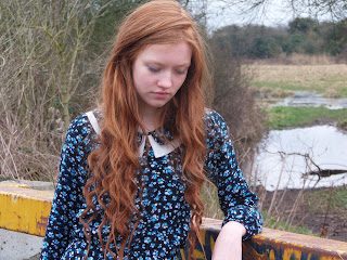
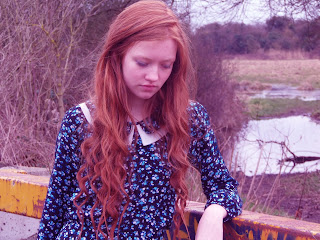 This is the original image of my artist, Sofie [Scholten]. Location: Snuff Mill Field
The pose with the graffiti on the bar shows an edgy girl though the slumped pose suggests the girl is in transition from sadness to happiness. Similar to the message in the music video
*The artist looks like this [hair and setting] in the music video so it's appropriate for this to feature in the album artwork* - Wez Foster
I have manipulated the image similar to the scenic shot where I have added a pink emphasis to the image. This is the image that would appear on the inside of the cover which matches that of the scenic shot.
The pink also includes a girly sense therefore appeals to its target audience.
I have also blurred the background slightly to ensure that my artist stands out.
*The pink makes this consistent with the theme and features the artist - important for an indie genre. I also enjoy looking at this image as it is well photographed* - Wez Foster
This is the original image of my artist, Sofie [Scholten]. Location: Snuff Mill Field
The pose with the graffiti on the bar shows an edgy girl though the slumped pose suggests the girl is in transition from sadness to happiness. Similar to the message in the music video
*The artist looks like this [hair and setting] in the music video so it's appropriate for this to feature in the album artwork* - Wez Foster
I have manipulated the image similar to the scenic shot where I have added a pink emphasis to the image. This is the image that would appear on the inside of the cover which matches that of the scenic shot.
The pink also includes a girly sense therefore appeals to its target audience.
I have also blurred the background slightly to ensure that my artist stands out.
*The pink makes this consistent with the theme and features the artist - important for an indie genre. I also enjoy looking at this image as it is well photographed* - Wez Foster

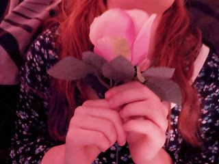 This is my original image of the image that is on my back cover. Location: My house - bed. Prop: Rose
I understand that this image has been taken in low lighting conditions because during this shoot I was reliant on fairy lights for my lighting to create a magical effect.
I have placed a rose in the shot which links to the house style colour choice (pink) and represents the girly essence I like to include.
*Although the image doesn't include the artist the focus on the rose is an effective technique as you do not want to include the artist too much* - Melissa Ford
This is my original image of the image that is on my back cover. Location: My house - bed. Prop: Rose
I understand that this image has been taken in low lighting conditions because during this shoot I was reliant on fairy lights for my lighting to create a magical effect.
I have placed a rose in the shot which links to the house style colour choice (pink) and represents the girly essence I like to include.
*Although the image doesn't include the artist the focus on the rose is an effective technique as you do not want to include the artist too much* - Melissa Ford
I have brightened this image to make the details of what is in the frame clearly visible and again, added the same pink tint.
On the actual back cover with the track listing on I have added a blur which washes the background out. This makes the track listings stand out.
*I love this photo on the back including the track listings. It looks really right and like a professional back cover* - Melissa Ford

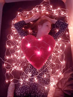 The original image of Sofie. Location: My house - bed. Props: heart shaped pillow and fairy lights.
I am proud of my idea of including the fairy lights in my photo although I know the original image suffers because of the low lighting but I was hopeful to edit it correctly to make it appear nicer.
*What you have done is clever, including the pillow and fairy lights in such a way that it looks magical. It resembles the original artwork for the album your chosen song is from which I think is effective* - Daniel Mail
The original image of Sofie. Location: My house - bed. Props: heart shaped pillow and fairy lights.
I am proud of my idea of including the fairy lights in my photo although I know the original image suffers because of the low lighting but I was hopeful to edit it correctly to make it appear nicer.
*What you have done is clever, including the pillow and fairy lights in such a way that it looks magical. It resembles the original artwork for the album your chosen song is from which I think is effective* - Daniel Mail
I increased the brightness of this image to make sure that the image is visible. Again, I kept with the consistency and emphasised the pink to the image.
In the final front cover makes this image cropped as well as the artist's name and the album name.
*I really like this. It is very stylish and stands out. I can understand why this would appeal to girls because of the pink hue* - Daniel Mail.
Planning
For my planning stages I began to use Windows Movie Maker to create my
Animatic, although I struggled to accurately place the fast paced editing to the beat of the song. Because of this, I used Adobe Premier Pro to complete the animatic correctly in time to the beat and did this successfully.
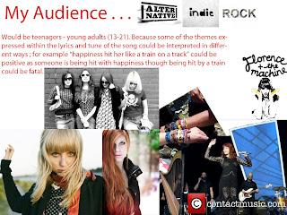
I also used Google and Google Maps a lot. For example, Google was used to help collect research of my target audience, for which I searched Alternative Indie Rock which came up with such images like festivals as well as artists in that category, as well as the fashion of that scene.
I also used Google Maps to help search for locations of which to film;
The train tracks in Cottingham, nearby to the alleyway where the "bumping into each other" scene and the train station where the meeting scene took place
The field in Cottingham - Snuff Mill Lane, where some performance pieces were shot as well as still images for the ancillary texts.
The beginning of the alleyway from the "bumping into each other" scene
Snuff Mill field - Performance and still images
Evaluation
Prezi enabled me to create thought showers and explanations to sum up a certain point in the evaluation questions.
Goanimate allowed me to make a quirky conversation with animated characters explaining or supporting a point I was making.


 How I did this effect was similar to the symmetrical drinking effect where I had the original base footage of Sofie on the phone, then put Blue's footage over it. I then put a linear wipe on around 50% of the footage of Blue and feathered it to 90% to make the wipe smoother, then I set that footage to less exposure, giving the fading effect.


 I also used Google and Google Maps a lot. For example, Google was used to help collect research of my target audience, for which I searched Alternative Indie Rock which came up with such images like festivals as well as artists in that category, as well as the fashion of that scene.


 I put my final edit on Facebook for my friends to like, comment and share in order to get a more accurate audience feedback.

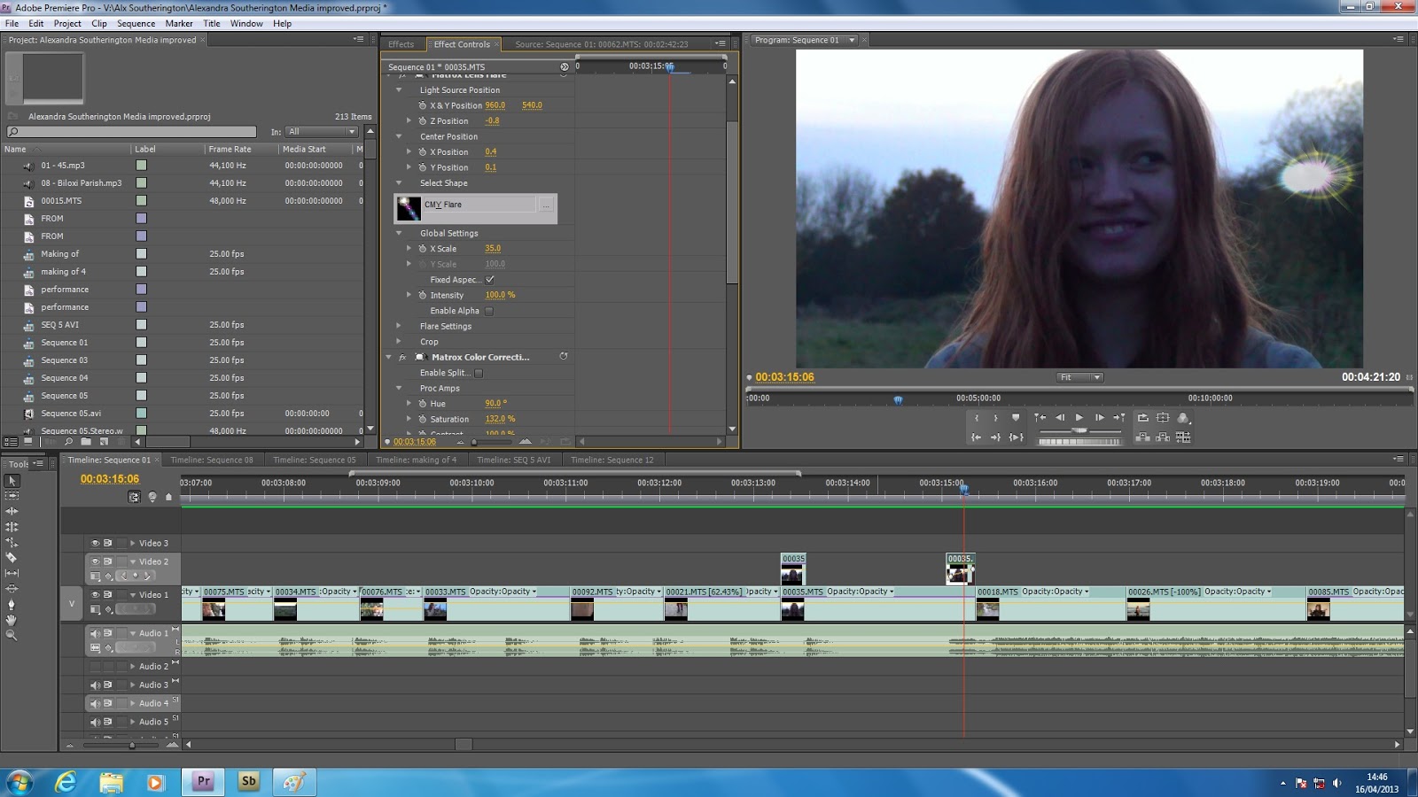
 Sofie talks about the effect used towards the end of the music video where I used a matrox shine and a CMY flare to manipulate the the lighting used.
 Especially this "rainbow" effect, as Amy describes it.
 Reassures me that it's a feelgood song and oozes happiness which is how I wanted it to come across. She also enjoys the slow motion effect where I changed the speed rate of the shot which is a powerful show motion shot as it emphasises the happiness state that he is in now and overcoming that the artist has gone though.


